Creating a Paragliding Dashboard with Recharts
Apr 28, 2024
REACT, TYPESCRIPT, NEXT.JS
|
15 MIN READ
Introduction
One of my goals when I began learning web development was to develop a dashboard app for local paraglider pilots. The idea was to reduce some of the time spent preparing for flights in my local area. My friends and I would spend so much time jumping from website to website in an attempt to glean as much data as possible, only to start all over again an hour later.
This frantic, repetitive checking of weather is not quite doom-scrolling but it does feel equivalent sometimes, especially when conditions worsen and the time invested turns out to have been wasted.
On top of that, the main source of wind data that we used needed to be refreshed every couple of minutes to get the latest data. This would get very tiring when standing on launch late in the evening waiting for the wind to die down. We would basically be staring at our phones most of that time waiting for a javascript-heavy website to fully load 10, 20, 30 times, until the wind got to a point we were happy with.
The same was true for checking conditions during a flight, which really distracted attention from where it was needed!

So, when I had some free time between courses I built it. I came up with a solution that allows me to quickly gather all of the information I need to make a decision of whether to fly or not. It's an SPA built with Next.js that updates a few different widgets on custom intervals. The intervals are mapped to their relative API's update interval to ensure that the data always stays current. Instead of having to constantly refresh, the UI updates on the client whenever a new data point is produced. This involved scraping some local weather sites, APIs and webcams.
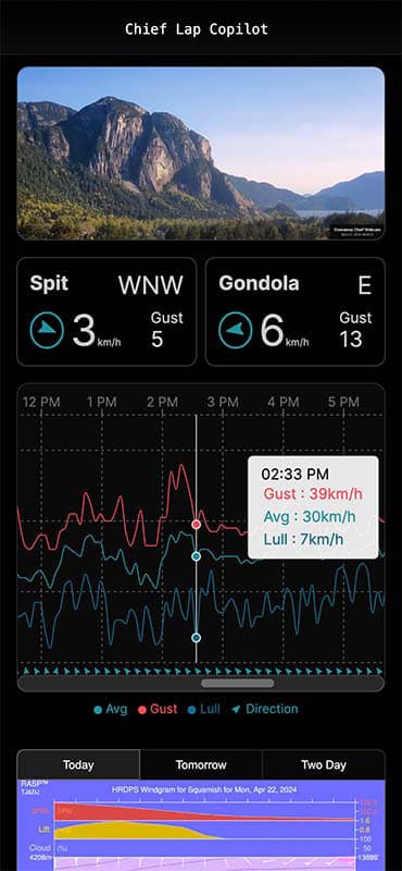
I ensured that a quick scan of the site on a mobile device would provide all of the essential information needed to prepare for a safe flight. The most important element of the site is the wind graph, which shows the overall trend and gusting patterns of the low-level valley wind. On a clear or otherwise decent looking day, this is the data that tells us whether it is safe to fly or not. The next section will describe how I went about creating this component.
The API
The local wind meters provide the most important information for a pilot. Their APIs usually provide a number of nested arrays, with each value being an array containing a timestamp and a value. Using arrays of speed values and an array of direction values. While the last hour or so of data is the most useful for a pilot on launch, the previous 24 hours is useful for the pilot at home trying to make a prediction of how the rest of the day will go. I decided to display the last 24 hours of data on a line chart.
Once I had decided on this format, I spent some time looking at different charting libraries and seeking recommendations from the dev community. After trying out a few of them, I settled on Recharts.
Recharts
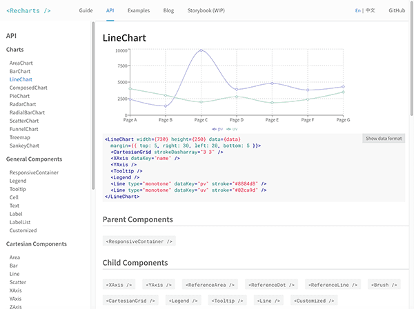
Recharts is a component based charting library with a lightweight dependency on D3 submodules. It's documentation is fantastic and features many working examples of different charts with their code. I quickly got a basic chart up and running after spending 15 minutes or so browsing through the docs. I then began to plan out what I would need once I had an idea of what might be possible.
The Scope
My requirements for the wind graph were as follows:
- A line chart with 3 colored lines measuring wind speed: Average, Lull and Gust.
- An X-axis at the top of the chart showing the time of day in one hour increments.
- An X-axis beneath the chart showing the wind direction of each point in the form of an SVG arrow.
- A Y-axis fixed to the right side of the chart showing wind speed. This should show wind speeds in increments of 20kmph and should extend above the top wind speed (So that a tick of 40kmph can be seen if the wind is blowing 30kmph).
- A scrollable container, so that the previous 24 hours of data can be viewed at a decent resolution.
- A grid to make it easier to track values when scrolling along the chart.
- A legend showing the color of each element and what it represents.
- A tooltip showing the three windspeed values of a given point when selected. It should include the timestamp of that point.
Getting Started
To begin, I copied a response from the API request I would be using into a json file, and imported this into my WindChart component. I prefer to work with static data in development so that I'm not making unnecessary requests to an API.
import testData from '@/app/lib/data/testData.json
Then I created a container div to hold the chart. I gave it a ref containerRef and the styles
max-width: 100%; and overflow-x: scroll. I added a client-side hook to scroll the container to the end to ensure the latest data is shown when the page is loaded and whenever the data is updated.
useEffect(() => {
  containerRef.current && (containerRef.current.scrollLeft = containerRef?.current?.scrollWidth)
}, [data])
Next, I created the LineChart component within this container and passed in the data, mapped to a format that worked with my design.
<LineChart
    width={1600}
    height={300}
    data={data.wind_avg_data.map((e, i) => ({
    time: e[0],
    avg: Math.round(e[1]),
    gust: Math.round(data.wind_gust_data[i][1]),
    lull: Math.round(data.wind_lull_data[i][1]),
    dir: data.wind_dir_data[i][1],
    }))}
>
To create a semi-transparent grid, I nested a CartesianGrid component inside of the main chart component.
<CartesianGrid strokeDasharray='3 3' stroke='currentColor' opacity={0.3} />
Lines
Lines can be added to the chart using the Line component. I started with the average wind speed data:
<Line
  type='monotone'
  dataKey='avg'
  stroke='#1d91a0'
  dot={false}
  activeDot={{ strokeWidth: 1, r: 4 }}
  xAxisId={0}
  isAnimationActive={false}
/>
The dot prop specifies whether there should be a dot at each point, and the activeDot prop allows styling of the dot that appears when the point is hovered. The purpose of the xAxisId prop is to assign the data from the line to the main X-axis, which will cause the time ticks to align with the average windspeed data points.
I then added two more lines for lull and gust, with the additional prop connectNulls={true} which ensures that the lines are connected if any data points are missing, which is sometimes the case with these specific values from my local API.
X-Axis
Next, I created an XAxis component and linked it to the time dataKey in the main data object.
<XAxis
  xAxisId={0}
  axisLine={false}
  dataKey='time'
  domain={['auto', 'auto']}
  orientation='top'
  scale='time'
  type='number'
/>
domain={['auto', 'auto']} will make X-Axis begin and end at the first and last points. scale='time'andtype='number'` will ensure the points are placed correctly along the axis. However, at this point, the timestamps/ticks on the X-axis seemed to be all over the place. Actually, only a small number were being displayed because there was not enough room for them. After a quick look through the docs, I realized that I had to come up with a function to determine a fixed number of ticks to be displayed.
I wasn't sure how to go about this, so I spent some time searching through Github issues until I found something that looked promising.
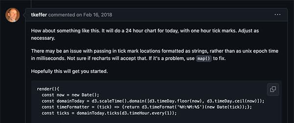
Here's the snippet that was provided:
const now = new Date()
const domainToday = d3.scaleTime().domain([d3.timeDay.floor(now), d3.timeDay.ceil(now)])
const timeFormatter = (tick) => {
  return d3.timeFormat('%H:%M:%S')(new Date(tick))
}
const ticks = domainToday.ticks(d3.timeHour.every(1))
This code appeared to be using a number of d3 submodules to generate an array of hourly ticks within a 24 hour domain. However, I didn't really want to import the three dependencies that were required. Despite them already being dependencies of Recharts, it would still mean having to install them separately and import them into my component. It's really not a big deal, but I prefer to have less dependencies when possible, so I decided to implement my own function:
const getTimeTicks = useCallback(() => {
  const ONE_HOUR = 3600000
  const startTime = data?.wind_avg_data[0][0]
  const endTime = data?.wind_avg_data[data?.wind_avg_data.length - 1][0]

  // Round the startTime up to the nearest whole hour
  const firstHour = Math.ceil(startTime / ONE_HOUR) * ONE_HOUR

  // Calculate the number of hours between the rounded start time and the end time
  const hourlyTicks = Math.ceil((endTime - firstHour) / ONE_HOUR)

  // Generate an array of timestamps for each hour
  // return Array.from(Array(hourlyTicks).keys()).map((i) => firstHour + i * ONE_HOUR)
  return Array.from({ length: hourlyTicks }, (_, i) => firstHour + i * ONE_HOUR)
}, [data])
This would calculate the nearest whole hour to my first data point and begin the ticks from there up until the closest hour to my last data point. I added it into the XAxis component along with the custom formatting function below and hit save. My ticks were perfectly aligned!
<XAxis
    ...
     ticks={getTimeTicks()}
     tickFormatter={(time) =>
         new Date(time).toLocaleString('en-US', { hour: 'numeric', hour12: true })
     }
/>
At this point I noticed an error in my console.

A quick search on Github turned up the following solution:
const error = console.error
console.error = (...args: any) => {
  if (/defaultProps/.test(args[0])) return
  error(...args)
}
This is a basically a hack that extends the console's error logging function with a conditional. It checks for the specific error and exits with a return statement if it is matched. It's not ideal, but judging from the comments on Github it was the best available solution. (At least until the problem is addressed in a future version.) It worked for me, so I continued on with the line chart.
Wind Direction
The next task was to create another xAxis component to display the wind direction. I wanted this to be represented by an SVG arrow. Looking through the docs, I saw that I could pass a custom component to the tick prop of the XAxis component. This component gets some props under the hood which can be destructured. The x, y props are used to position the svg, and the payload prop contains data about the specific value at that point in the chart.
When I explored the payload by logging it in the console, I found that I would also need to pass the array of direction values to the component as props. This would allow me to use the index from the payload to get the corresponding wind direction angle from the data, and to use that to transform the SVG arrow to make it point in the right direction. Here is my custom tick component:
const CustomXAxisTick = (props: CustomXAxisTickProps) => {
  const { x, y, payload, directionArray, size = 12 } = props

  return payload ? (
    <svg
      x={x}
      y={y}
      stroke='currentColor'
      fill='#1d91a0'
      strokeWidth='0'
      version='1.2'
      baseProfile='tiny'
      viewBox='0 0 24 24'
      height={size}
      width={size}
    >
      <g transform={`rotate(${directionArray[payload.index][1] + 135} ${size} ${size})`}>
        <path d='M10.368 19.102c.349 1.049 1.011 1.086 1.478.086l5.309-11.375c.467-1.002.034-1.434-.967-.967l-11.376 5.308c-1.001.467-.963 1.129.085 1.479l4.103 1.367 1.368 4.102z'></path>
      </g>
    </svg>
  ) : null
}

export default CustomXAxisTick
Which I then passed to the tick prop of my new XAxis component:
<XAxis
  xAxisId={1}
  dataKey='dir'
  tickFormatter={(time) => ''}
  tick={<CustomXAxisTick directionArray={data.wind_dir_data} />}
  axisLine={false}
  tickLine={false}
  mirror={true}
  tickMargin={-8}
/>
As you can see, I passed a function that returns an empty string to the custom formatter function and disabled the axisLine and tickLine elements. I also mirrored the axis to place it at the bottom of the chart, and used tickMargin to position the ticks where I wanted them.
Tooltip
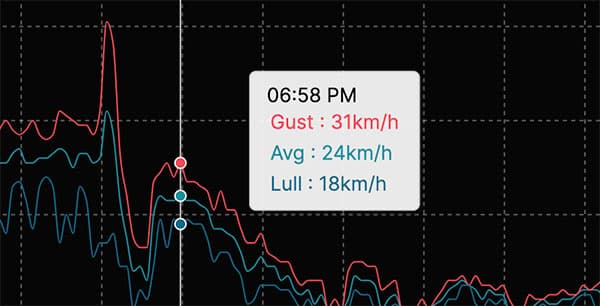
Another item in my requirements was the tooltip, which would give the user more information when they tapped or hovered a point on the chart. For this, I added the Tooltip component from the Recharts library to my chart and slowly customized it, referring back and forth to the docs until I was happy with the result. At this point I had become quite comfortable with the Recharts APIs, so it didn't take long to get it the way I wanted. As usual, Recharts does all of the heavy lifting. Here is the finished component placement:
<Tooltip
  offset={50}
  formatter={(value: number, name: string) => [
    value + 'km/h',
    name[0].toUpperCase() + name.slice(1),
  ]}
  label='time'
  labelFormatter={(label) =>
    new Date(label).toLocaleTimeString('en-US', { hour: '2-digit', minute: '2-digit' })
  }
  labelStyle={{ display: 'block', color: 'rgb(var(--background-start-rgb))' }}
  contentStyle={{
    padding: '0.5rem 0.75rem',
    fontSize: '0.9rem',
    backgroundColor: 'color-mix(in srgb, currentColor 90%, transparent)',
    borderRadius: '5px',
  }}
  itemStyle={{ padding: '0.15rem' }}
  itemSorter={(item) => {
    switch (item.dataKey) {
      case 'gust':
        return 0
      case 'avg':
        return 1
      default:
        return 2
    }
  }}
/>
And here's how it looks on the page:
Legend
The final piece to add was the legend, so I added a Legend component from the library. Recharts only allowed me to include symbols for each line in the chart, whereas I wanted to include a labelled arrow symbol to make it explicit that each arrow represents wind direction.
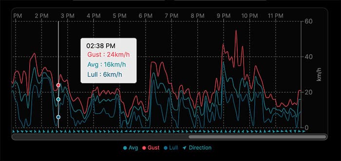
To achieve this, I set up the Legend component the way I wanted it, and then simply copied the html from my local server and pasted it into a new custom component of my own. I added another key to this custom Legend component using the arrow SVG and a "Direction" label. I exported this and then imported it into my chart component and placed it beneath the rest of the chart. Here is the finished chart:
Finishing Up
With the UI finished, I created an action to fetch the live data and added a hook to fetch on an interval and set state each time new data comes in, which keeps the chart data current on the client. I then added the rest of the components to my app. These include an iframe of a live weather cam from the local mountain, some cards providing live data from some other local wind meter APIs, and a windgram image interface that allows users to toggle between windgrams at different local sites over a selection of time periods.
(Windgrams are used to quickly gather data on an air mass at a specific location. They show the wind direction, temperature and lapse rate at different altitudes and how each changes over time.)
I also included a links section with links to the most relevant resources for pilots planning cross country flights.
Conclusion
Overall I'm really happy with how the app turned out. I'll continue to improve it as it as it gets tested in the field, and may do a redesign at some point. (I barely touched the css boilerplate that was generated by the create-next-app). There is also potential to expand the app to include more popular flying sites.
I'm also happy that I got to explore such a great library. I'll definitely be returning to Recharts for any future data-vis projects. It was a real pleasure to work with.
View the repository on Github.